Cerbos Hub is where a lot of different people end up during a working week. An engineer opens it to see why a policy build failed. Someone from the security team pulls up the decision logs ahead of an audit. A product manager wants to confirm what a role can do before a customer call. They are all looking at the same product, rarely at the same screen, and none of them want to spend longer there than they have to.
The new Cerbos Hub interface is built around that. Every screen has a new visual design, and nothing has been added or removed underneath it. Everything works the way it did. Here is what changed and what it means for how you use Cerbos Hub day to day.
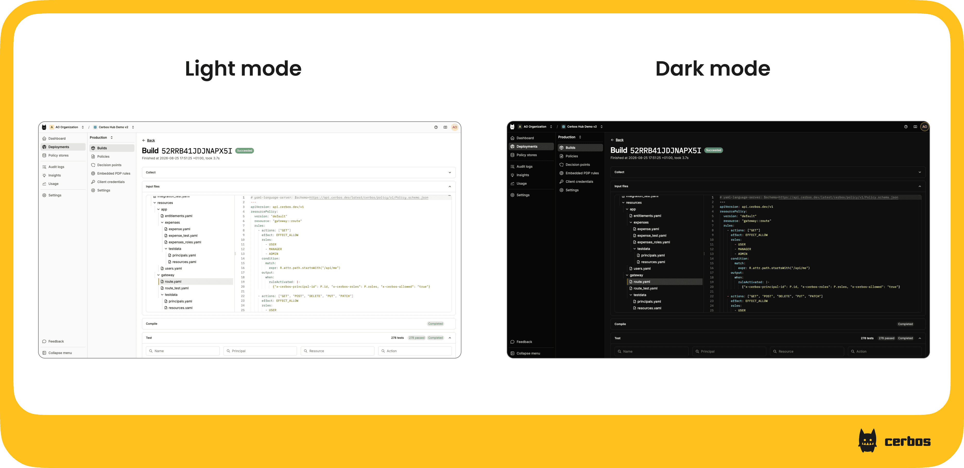
Cerbos Hub follows your system theme, in dark or light
Hub now picks up the theme from your operating system. If your editor and terminal are dark, Hub is too, and it switches when your system does. If you'd rather have one look everywhere, you can set it manually and it stays put.
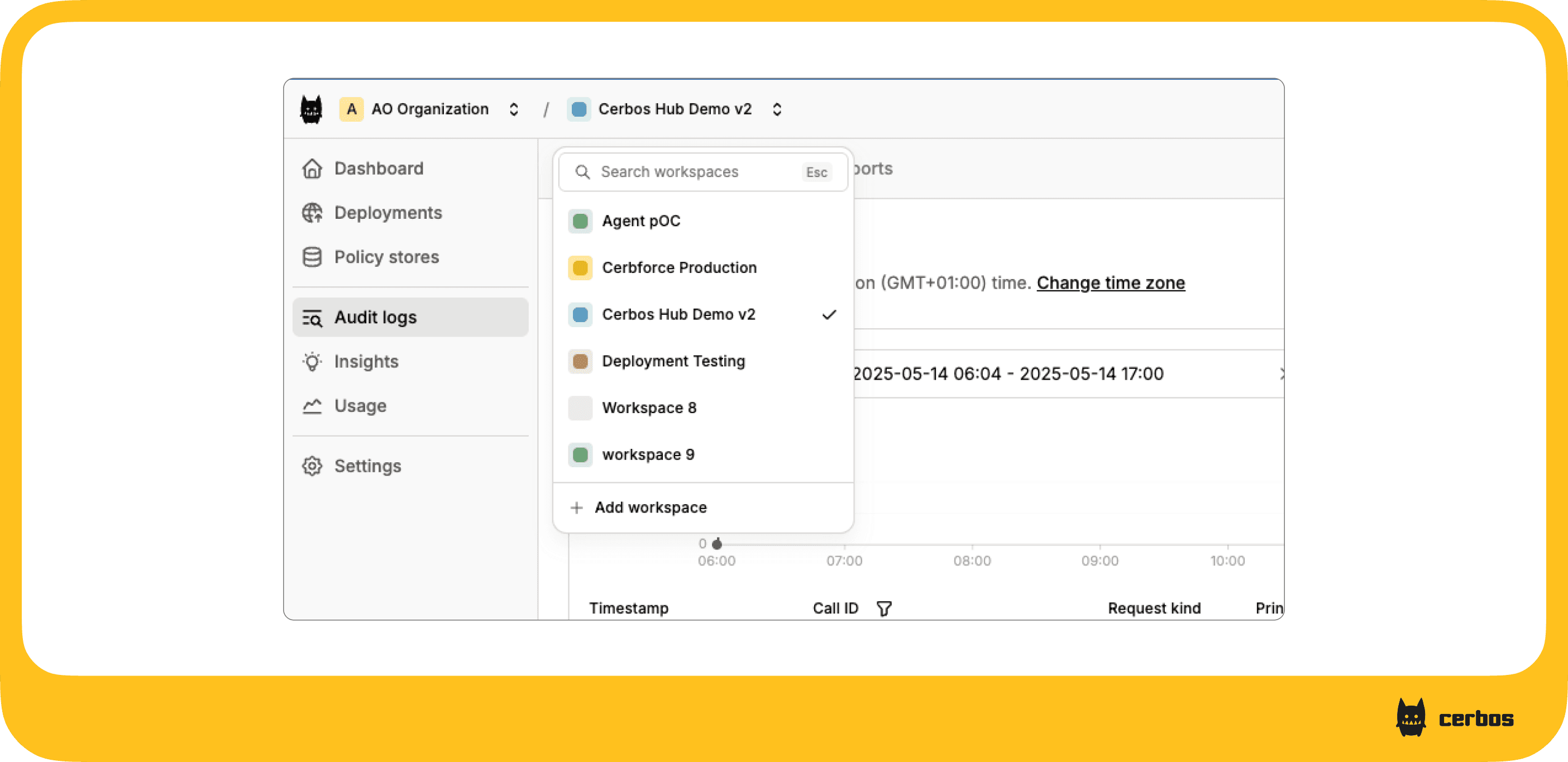
Switch organizations and workspaces from any screen
The organization and workspace you're in now sit in a navigation bar at the top of every page. Switching happens from there, with a search box for teams that run a lot of workspaces, and you stay on the page you're on. If you're partway through reading a deployment's policies for one workspace and need to check the same thing in another, you don't lose your place.
More rows on screen in policy lists and audit logs
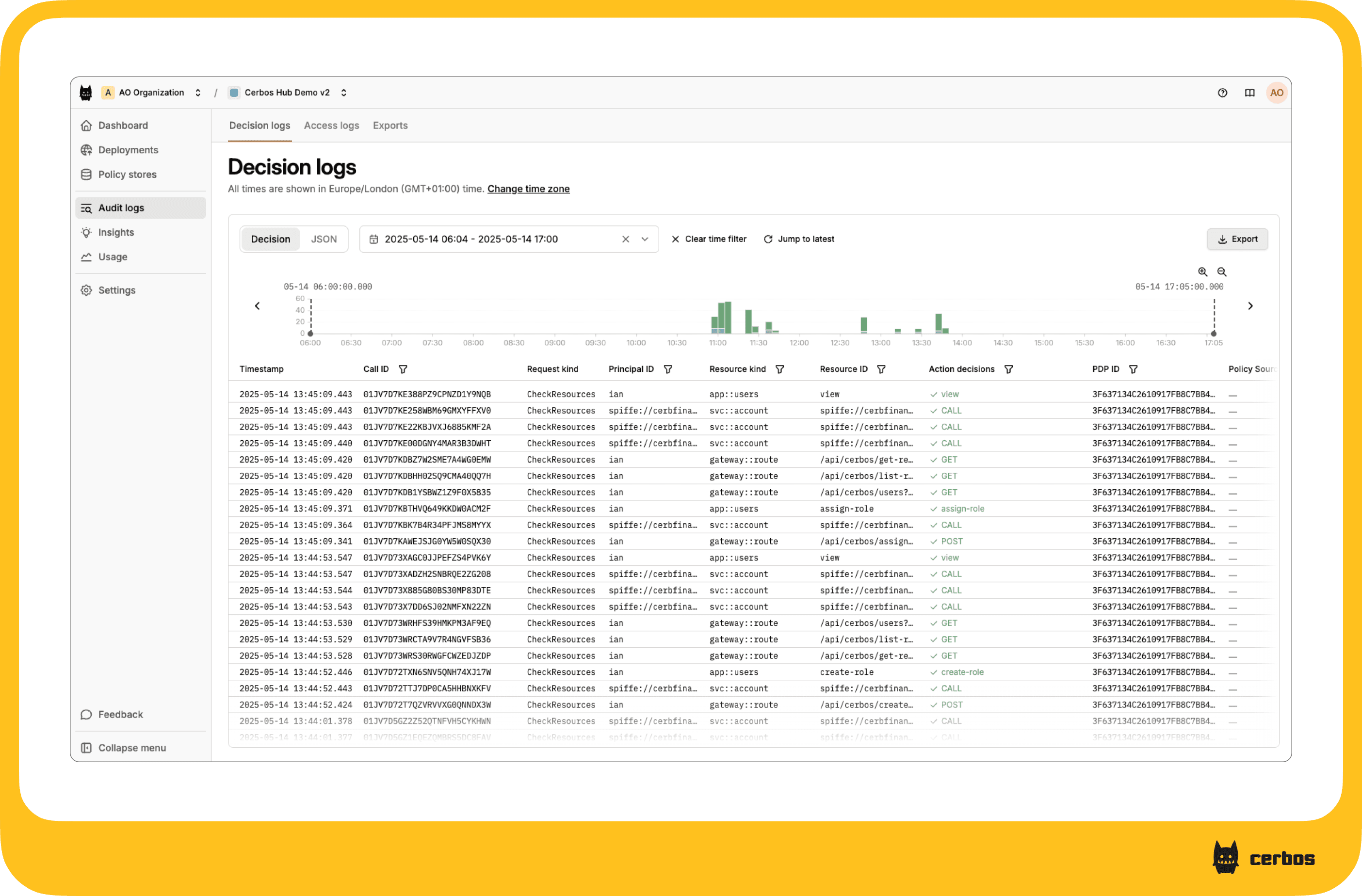
Common views like policy lists and audit logs show more on each screen, so there is less scrolling to find what you're after. This is most noticeable in the decision logs tab. When you're tracing one request through a busy window, or working through a time range an audit reviewer has asked about, seeing more decisions at once means less paging back and forth and less context lost between screens.
Improved accessibility, which also helps agents and automation drive Cerbos Hub
The markup across the app has been updated and every part of Hub can now be worked with a keyboard alone, in line with current accessibility standards. That matters for anyone who relies on a keyboard or a screen reader.
It also has a side effect some teams will care about just as much. Clean markup with proper labels is easier for browser automation to work with, and for AI agents that operate Hub directly on someone's behalf. If you're already pointing an agent at Cerbos Hub, or planning to, it will have an easier time finding its way around.
Nothing to migrate and nothing to reconfigure
There is no action needed on your side. Existing organizations, workspaces and policies are exactly where they were and behave the same way. The next time you sign in, you'll see the new interface.
If you haven't used Cerbos Hub before, this is a good moment to have a look. Cerbos Hub is the part of the Cerbos authorization management platform where policies get written, tested, versioned and pushed out to every policy decision point without a restart, and where the record of every decision those decision points make lives.
Sign in to Cerbos Hub to see the new interface, or book a call if you want to walk through how Cerbos Hub fits your setup with the team.
Tagged in